Free monitor sharpness test online. Check text clarity, color fringing, sub-pixel layout, and pixel-grid moire on your display. Lagom-style sharpness pattern, multi-size text samples, and full-screen mode. Browser-based, no install.
Render Lagom-style 1px pixel-grid patterns, multi-size text samples in three font families, color-fringing blocks, and an RGB sub-pixel ruler to evaluate how sharply your monitor reproduces fine detail. Toggle dark mode and full-screen any pattern to inspect under real viewing conditions — all in the browser, no install.
Lagom-style sharpness patterns
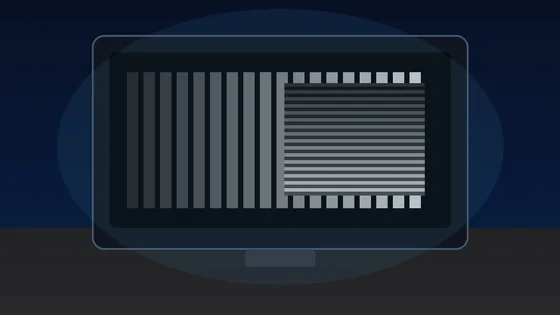
Each block is a 1px alternating black/white grid drawn at the device pixel ratio. On a correctly-scaled monitor with neutral sharpness, every block should look like a uniform mid-grey at arm's length. Visible banding, moire, or shimmer means OS scaling, monitor over-sharpening, or a non-native resolution is interfering with pixel-perfect rendering.
Text clarity at 8 sizes × 3 fonts
Read each block. Small text should remain crisp, not fuzzy. The same paragraph is rendered in serif, sans, and monospace at 12-64 px so you can compare hinting, stem thickness, and grayscale anti-aliasing.
Color fringing detection
Look at the edges of each character. If you see thin red, green, or blue halos along letter strokes, that is chromatic aberration from sub-pixel anti-aliasing on a non-RGB-stripe panel (e.g. RWBG, BGR, OLED PenTile). Black-on-white and white-on-black often render with different sub-pixel hinting.
16px black on white
The quick brown fox jumps over the lazy dog. 0123456789
Sharpness
16px white on black
The quick brown fox jumps over the lazy dog. 0123456789
Sharpness
Aa Bb 0123
Aa Bb 0123
Sub-pixel layout ruler
A 1px wide repeating pattern of pure red, green, blue, and black columns. Lean in close (or use a phone camera macro). On a standard RGB-stripe LCD you should see a clean R-G-B-K stripe; on a BGR panel the order reverses; OLEDs with PenTile arrangement will look mottled. This tells you the pixel layout your monitor uses for sub-pixel anti-aliasing.
Denser RGB+black:
Solid R/G/B reference (helps identify a stuck pixel within a column):
Was this tool helpful?Rate Monitor Sharpness Test:5.0(2 ratings)Thanks for rating!
Monitor Sharpness Test is a free, browser-based screen testing tool that runs the full check instantly in your web browser.
Cost: Free, no signup
Install: None — runs in the browser
Privacy: Runs locally, no uploads
Platforms: Windows, macOS, Linux, Android, iOS
Time: Under a minute
How The Monitor Sharpness Test Works
The pixel-grid panel draws a 1 px alternating black-and-white checker on a HTML <canvas> at the device pixel ratio (window.devicePixelRatio), so every drawn pixel maps to exactly one physical pixel on a properly-scaled monitor. The image-rendering CSS property is forced to pixelated / crisp-edges so the browser cannot smooth the grid before display. If your monitor's sharpness control is at neutral, your OS scaling is a round value, and your resolution is native, all six patterns should blend into a uniform mid-grey at arm's length. Visible banding, moire, or shimmer means one of those three settings is interfering with pixel-perfect rendering.
What "Sharp" Really Means On A Monitor
Sharpness on a monitor is the fidelity with which thin, high-contrast features are reproduced. It is determined by three things: panel pixel density (PPI), sub-pixel layout (RGB stripe vs BGR vs PenTile), and any post-processing the monitor's scaler applies (the "Sharpness" OSD control, edge enhancement, or interpolation when running below native resolution). At a typical 60-70 cm desk viewing distance, 90-110 PPI is acceptable and 140 PPI+ is "retina-class". Below 80 PPI you can see individual pixels. Above 200 PPI, sub-pixel anti-aliasing matters less because individual pixels disappear at normal viewing distance.
Color Fringing And Sub-Pixel Layout
Modern font renderers (DirectWrite on Windows, CoreText on macOS, FreeType on Linux) use sub-pixel anti-aliasing tuned for an RGB-stripe LCD. On a BGR panel, the fringing will be reversed and noticeable; on an OLED with a PenTile arrangement (some Samsung phones, some QD-OLEDs), the sub-pixels do not line up in vertical stripes at all and you will see slight color halos around dark-on-light text regardless. The sub-pixel ruler in this tool shows you which layout your panel uses: read the stripe order at very close range and compare against R-G-B (standard LCD), B-G-R (some VA panels), or a triangular pattern (PenTile OLED). If the order does not match what your OS expects, re-run ClearType (Windows) or disable sub-pixel rendering (macOS >= Mojave does this automatically on Retina displays).
Why Text Looks Different Across Browsers
Each browser renders text through a slightly different stack. Chrome on Windows uses DirectWrite by default but falls back to GDI on older versions. Firefox uses DirectWrite with its own gamma correction. Safari on macOS uses CoreText with its grayscale anti-aliasing (no sub-pixel). The same 14 px paragraph in this test can therefore look thicker in Firefox, slightly contrastier in Chrome, and softer in Safari. None of those are wrong - they are different anti-aliasing philosophies. If your text looks fuzzy in every browser, the cause is upstream: wrong OS scaling, non-native resolution, or a monitor sharpness setting that is not neutral. For a full walkthrough of all five, see our guide on why a monitor looks blurry - scaling, resolution and OLED text fringing, which pairs each cause with the patterns above so you can verify the fix by eye.
Why does the 1px pixel grid look like wavy bands instead of solid grey?
You are not running at the panel native resolution, your OS scaling is set to a fractional value (125% or 150%), or your browser zoom is not 100%. Each of those breaks the 1:1 mapping between drawn pixels and physical pixels, which is why the grid moires.
What is the correct "Sharpness" setting on my monitor?
Neutral. Most monitors have a 0-100 sharpness slider where 0 or 5 is the neutral pass-through value and anything higher applies edge enhancement that creates halos around text.
Why do I see red and blue halos around text on my OLED monitor?
OLEDs often use a non-standard sub-pixel layout (PenTile, RWBG, or QD-OLED triangular) instead of the RGB stripe LCDs use. Sub-pixel font anti-aliasing (ClearType on Windows, sub-pixel rendering on Linux) is tuned for RGB stripe and produces visible color fringing on these panels.
Does this replace the Lagom LCD sharpness test?
It serves the same purpose. Lagom is a static image with a single sharpness pattern; this tool draws the patterns dynamically at your device pixel ratio so they remain pixel-perfect on HiDPI displays where a static image would be upscaled.
01 / 10Monitor reality check1000Hz Is Real. Worth $999?LG's UltraGear 25G590B is the first native 1000Hz 1080p monitor. Check the fine print first.02 / 10The price$999.99 for 1080pThat is the LG.com launch price, confirmed Sept 10. A 24.5-inch IPS esports panel.03 / 10The 1 ms mathOne Frame Lasts 1 msAt 1000 Hz a frame is on screen for 1 ms—the same figure as LG's own 1 ms GtG response spec.04 / 10LG's own footnoteMBR Pro Turns Off VRRFreeSync Premium and G-SYNC Compatible are disabled while MBR Pro runs. The 1100Hz overclock drops FreeSync.05 / 10Feeding itCan Your PC Push 1000 fps?LG lists Windows 11, RTX 50 / RX 9070-class GPUs and DisplayPort 2.1. 1000 Hz does not promise 1000 fps.06 / 10Reality check1080p Is Still the Majority50.52% of Steam players ran 1080p in August 2026. LG is selling speed to the biggest resolution group.07 / 10Same moneyWhat $999 Buys InsteadA 480Hz QHD OLED tracked at $547.54 on Jul 30. LG's own 480Hz dual-mode 27G850A: about $699.99.08 / 10Verdict splitBuilt for One Kind of PlayerSerious FPS competitors with GPUs to match may justify it. Everyone else buys sharper pixels for less.09 / 10Delivery dayTest Before You TrustVerify the refresh rate your system actually reports, frame skipping, dead pixels and motion clarity.10 / 10Your turnCheck Your Refresh RateSee what your browser reports right now. A browser check reads reported rate, not certified panel speed.
01 / 10Phone buying guidePWM-sensitive? Test the phone, not the promiseDisplay specs narrow the shortlist, but no OLED is comfortable for everyone.02 / 10Build the shortlistStart with the display strategyCompare LCD, DC-dimming and high-frequency PWM options. Each still needs a real-use check.03 / 10Read the evidenceSpecifications are only a filterFrequency, modulation, brightness and firmware can all change how a screen behaves.04 / 10Before testingEnable the documented display settingToggle names and effects vary by model. Confirm the current manual before testing.05 / 10First passTest at your normal brightness firstUse the reading, video and scrolling tasks you actually do each day.06 / 10Low-light passRepeat at a lower brightnessOLED dimming behavior may change as brightness falls. Keep the same room and screen content.07 / 10Store checkCompare camera bands, not just one photoUse the same camera, exposure and distance on each phone for a fair comparison.08 / 10Read cautiouslyBanding is a clue, not a lab resultCamera bands can reveal pulsing, but not exact PWM, modulation or medical conclusions.09 / 10Final decisionLet the return window settle the choiceTry normal use briefly. Stop if discomfort occurs; return it before the seller's deadline.10 / 10One last checkRun one controlled flicker comparisonUse the same brightness and camera setup, then save the result with your buying notes.
01 / 10Screen flicker testYour screen may be flickeringMany displays dim by switching the backlight on and off hundreds of times a second.02 / 10The symptomSore eyes and evening headachesStrain that gets worse at night, on one device but not another, is the clue.03 / 10What PWM meansDimming by blinking, not fadingInstead of lowering brightness, the backlight pulses. Faster pulsing is easier to tolerate.04 / 10Why night is worseLower brightness, deeper flickerThe dimmer you set the screen, the longer the backlight stays off between pulses.05 / 10Run the testWatch the moving patternA flickering backlight breaks the motion into separate copies instead of a smooth trail.06 / 10What to look forBands mean pulsingClear repeated edges suggest PWM. A smooth blur suggests steady, flicker-free dimming.07 / 10Not everyoneSome people never noticeSensitivity varies widely. Migraine and dry eyes can make the same screen unbearable.08 / 10What helpsRaise brightness, lower contrastHigher brightness usually shortens the off phase. Warm light and screen breaks help too.09 / 10One honest limitA browser cannot measure hertzThis shows whether flicker is visible to you, not the exact PWM frequency.10 / 10Your turnSee how your screen dimsRun the pattern at full and low brightness, then compare your devices.
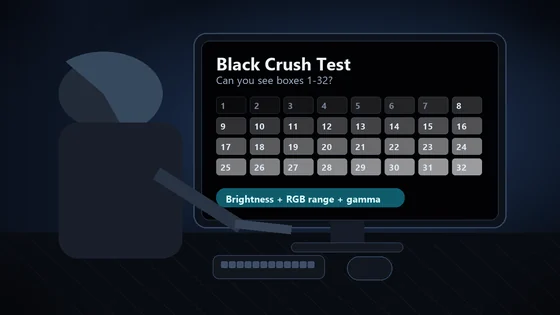
01 / 10Monitor checkDark scenes losing detail?Your monitor may be turning several near-black shades into one flat black.02 / 10The symptomShadow texture disappearsHair, clothing, caves and night scenes merge into featureless black. That is black crush.03 / 10Before you testUse normal SDR settingsDim the room, avoid glare and let your eyes adapt for 30 to 60 seconds.04 / 10The testLook for 32 near-black stepsPatch 1 is darkest. Patch 32 is easiest. Use fullscreen and do not expect the low steps to glow.05 / 10Read the resultFind the first visible patchIt should be barely separate from the black background. Note its number.06 / 10ExcellentYou can see 1 through 32Your display is preserving very dark shadow steps. Subtle is correct.07 / 10Mild crushingVisibility starts near 4Brightness may be too low, or gamma may be hiding the first few steps.08 / 10Moderate to severeVisibility starts at 8 or 16Check the monitor black-level setting and whether the GPU is sending Full or Limited RGB.09 / 10Fix one variable at a timeBrightness. Range. Gamma.Retest after each change. Establish a clean SDR result before troubleshooting HDR.10 / 10See what your display keepsRun all 32 shadow stepsThe live tool is the proper diagnostic surface; compressed story images are only a guide.